Streamlining Case Insights with LLMs
Redesigning a complex dashboard to enhance user experience, improve productivity, and drive business growth. By focusing on usability, customization, and transparency, we were able to create a powerful tool that empowers users and delivers tangible results.
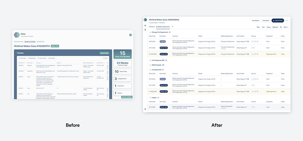
Problem Statement
Our existing dashboard was hindering user productivity and satisfaction. Key issues included:
Poor Usability: An unintuitive and inconsistent interface made it difficult for users to navigate and find information.
Limited Customization: Users lacked the ability to filter, group, and save custom views, leading to frustration and inefficiency.
Opaque AI Summaries: Users were unable to trace the source of AI-generated summaries, raising concerns about transparency and reliability.
These limitations were directly impacting customer satisfaction and retention, as well as hindering business growth.

Design Solution
To address these challenges, we embarked on a comprehensive redesign of the dashboard, inspired by modern spreadsheet UX. The core objectives of the redesign were to:
Enhance Usability: Simplify the interface, improve information hierarchy, and ensure consistent visual language.
Enable Customization: Empower users to create personalized views, filter data, and save their preferences.
Increase Transparency: Surface the sources of AI-generated summaries, providing context and building trust.

Key design features included:
Flexible Filtering and Grouping: Users can easily filter data based on various criteria and group related information.
Customizable Views: Users can save their preferred views for quick access and efficient workflow.
Transparent AI: AI-generated summaries are accompanied by source information, allowing users to verify accuracy and make informed decisions.

Results
The redesigned dashboard has been well-received by users, leading to significant improvements in:
User Satisfaction: Positive feedback from users highlights the improved usability and customization options.
Productivity: Users are able to complete tasks more efficiently and effectively.
Business Impact: The new dashboard has directly contributed to increased sales and customer retention. LawPro was able to close 3 sales within 3 weeks of using the prototype, representing a 200% increase.
Conclusion
By prioritizing user needs and leveraging data-driven insights, we were able to create a more intuitive, customizable, and transparent dashboard. This redesign has not only improved user experience but also positively impacted the bottom line.
Future Considerations:
Advanced Analytics: Explore the integration of advanced analytics to provide deeper insights into user behavior and data.
AI-Powered Personalization: Utilize AI to further personalize the dashboard experience for each user.
Continuous Improvement: Regularly gather user feedback and iterate on the design to ensure ongoing optimization.
By continuously evolving the dashboard, we can maintain a competitive edge and deliver exceptional value to our users.

Project Overview
This case study delves into the redesign of a data-heavy dashboard that was hindering user productivity and satisfaction. By prioritizing user needs and leveraging data-driven insights, we were able to create a more intuitive, customizable, and transparent interface. The redesigned dashboard has significantly improved user experience, increased efficiency, and positively impacted business outcomes. This case study highlights the importance of user-centered design and the power of data-driven decision-making in creating effective digital tools.
Company
LawPro AI
Role
Director of Design (Consulting)
Team
PM, Head of Engineering, Head of AI, CEO
TIMEFRAME
4 weeks